How To Read Stock Charts Like A Pro And Make Informed Decisions?
Unlock the secrets of financial markets with our comprehensive guide on how to read stock charts. Learn the key components, from trendlines to support and resistance, and gain the insights needed to navigate the dynamic world of stock market analysis effectively.
Author:Camilo WoodReviewer:Emmanuella SheaJan 12, 2024515 Shares32.1K Views
In the ever-evolving world of finance, the ability to decipher stock charts is an invaluable skill for both seasoned investors and newcomers alike. Stock charts are like the financial roadmaps that guide us through the twists and turns of a company's performance over time. In this guide, we will unravel how to read stock charts, exploring the key components that empower investors to make informed decisions and navigate the complexities of the stock market. They encapsulate a wealth of information, providing insights into historical trends, potential reversals, and the overall health of a stock.
What Is A Stock Chart?

A stock chart serves as a visual representation of an investment asset's price dynamics over time, offering a snapshot of its current value, historical performance (highs and lows), and trading volumes. The y-axis of the chart reflects prices, while the x-axis spans various periods, enabling analysis ranging from minutes to years. This graphical depiction empowers investors to discern trends and patterns, aiding in the formulation of informed strategies.
At the chart's base, a bar graph illustrates trading volume, quantifying the shares bought and sold within a specified timeframe. This volume metric reveals the market's appetite for a particular stock. Notably, investors keenly observe notable spikes in trading volume, often signaling insider or institutional activities, significant news events, or shifts in a stock's established trend or pattern.
As a pivotal tool in financial analysis, a stock chart equips investors with the insights needed to navigate the complexities of the market and make judicious investment decisions.
Stock Chart Components
Understanding stock charts is like navigating the financial seas, and Google serves as a compass for those diving into this world. By simply searching a company's ticker symbol, you'll find yourself in the shallow end of the pool during a financial swim lesson—a basic yet enlightening chart awaits. Not familiar with the ticker symbol? A quick online search will reveal it.
Take Apple (AAPL), the behemoth in the S&P 500, as our example. As of July 14, 2023, the chart highlights a closing price of $190.69, representing the last trade price during standard market hours (9:30 a.m. to 4 p.m. Eastern Time). Amidst these hours, prices fluctuate dynamically. The "after-hours" figure of $190.62 indicates the current trade price outside these conventional hours, offering insights into after-hours trading nuances.
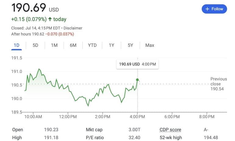
Notably, the closing price edged 15 cents higher than the previous trading day, registering a modest 0.08% increase from $190.54. The day's journey is vividly portrayed by the green line, illustrating price fluctuations throughout regular trading hours. Choosing alternative time frames unravels the tapestry of price changes during those intervals.
This dynamic line, tracing the stock's ascent and descent over time, forms the backbone of stock charts. The y-axis vertically measures prices in dollars, while the x-axis horizontally tracks the elapsed time within the selected period. In this chart, a gray line delineates the stock's performance during after-hours trading, adding a layer of insight beyond the conventional market hours.
As you delve into the depths of stock chart analysis, this foundational understanding arms you with the knowledge to decipher the waves of financial data and make informed decisions in the vast ocean of the stock market.
Types Of Trading Charts And How To Analyze Them
Price charts serve as visual narratives of the dynamic world of trading, encapsulating the ebb and flow of market activity within defined time periods - whether it's minutes, hours, or days. Each chart comprises essential data points, including opening, high, low, and closing prices. Traders, in their pursuit of market insights, commonly utilize three types of charts: line charts, bar charts, and candlestick charts.
Line Chart
An easy-to-understand type of price chart is the line chart. It draws a single line that joins all of a stock's ending prices over a certain amount of time.
Traders may not learn much from the line chart each day, even though it's easy to understand. That being said, it will make it easier for traders to spot trends and see how the closing price changes from one time to the next.
Many brokerages base the value of an account on the closing price, so this method can be useful for comparing a stock's trend or general performance to the market without having to worry too much about intraday changes.
Bar Chart
Another way to show how prices change is with a bar chart.
Bar charts help sellers see the range of prices over time. The size of bars can change from one bar to the next or across some bars. Watch how the bars get bigger and smaller as volatility goes up and down. The bars get bigger and the price moves further as the market becomes more unstable. When the market is less active, prices tend to move in smaller bars.
The different bar sizes are caused by the different ways each bar is built. The range of prices from the bar's high point to its low point is shown by its height. The price bar also shows the opening and closing prices for the time with horizontal lines attached. The left line shows the opening price and the right line shows the closing price.
Candlestick Chart
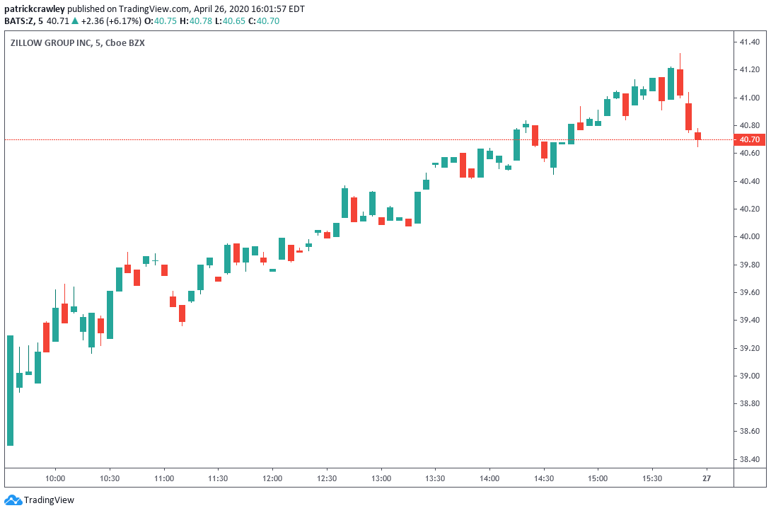
Another type of chart is the candlestick chart. By showing different "bodies" that are green or red depending on whether the stock ends higher or lower than the open, candles help you see whether people are bullish or bearish. The high and low prices are called the wick and shadow, and the body is the range between the opening and ending prices of the time intervals.
Using candles, experts can see how prices change when the market is going in a certain direction. When there is a normal bull market, there may be more groups of green candles than red candles. When there is a normal fall market, the opposite is true. Traders can use patterns made by certain pairings of candles to decide when to enter or leave a trade.
Stock Chart Patterns For Traders
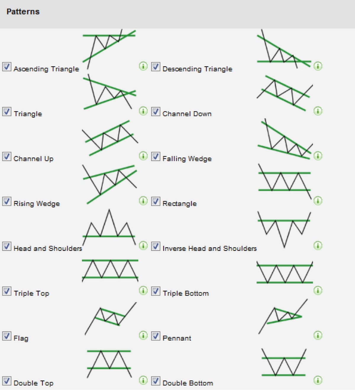
In the fascinating world of chart analysis, trends emerge as the heartbeat of market movements. An uptrend paints a picture of optimism, characterized by a series of higher highs and higher lows over time. Conversely, a downtrend unfolds with a melancholic tone, showcasing lower highs and lower lows. The chart becomes a visual symphony, where each movement speaks volumes about the stock's trajectory.
Within the rhythmic dance of trends lie two essential pillars - support and resistance. Support serves as a floor for stock prices, a resilient level where downtrends halt, sellers retreat, and buyers seize control. The point of reversal, where the stock ascends once more, marks a low price referred to as "support." It becomes a psychological stronghold, requiring considerable selling conviction to breach.
Conversely, resistance acts as a ceiling, restraining the upward momentum of rallying stocks. Buyers face a challenge to surpass this level in future rallies, demanding heightened conviction. Understanding these dynamics provides traders with strategic insights into potential reversals or continuations.
Support
Support, akin to a financial safety net, is where downtrends find their limits. As sellers lose steam and buyers gain control, the stock finds a footing. Should the stock retrace after a rally, a robust support level indicates resilience, compelling short sellers to reconsider their positions. The reluctance of the stock to breach support strengthens its significance, signaling potential shifts in market sentiment.
Resistance
Resistance, conversely, acts as a formidable barrier for rallying stocks. As prices ascend, the challenge for buyers intensifies. Breaking through resistance demands unwavering conviction. Identifying these barriers equips traders with foresight, guiding decisions amid rallying stocks and potential price reversals.
It's crucial to recognize that support and resistance are more than numerical levels; they are psychological benchmarks. Traders, akin to chess players, strategize around these points, developing plans that consider the ebb and flow of market sentiment. While these levels lack physicality, their impact on market dynamics is palpable, offering valuable cues for traders crafting meticulous strategies.
Basic Stock Chart Terms To Know
Navigating the intricate world of stock charts requires a firm grasp of fundamental terms that convey crucial information about a company's financial standing. Beyond the surface, these terms encapsulate the dynamic nature of the stock market, aiding investors in making informed decisions. Let's delve into these key terms to empower your understanding of stock charts.
1. Open, High, Low, And Previous Close
- Open -The opening price signifies the initial value at which a stock trades during regular market hours, setting the tone for the day's trading activities.
- High and Low -Reflecting market volatility, the high and low prices denote the peak and trough values a stock attains within regular trading hours. They provide insights into the stock's price range and potential trends.
- Previous Close -This term encapsulates the closing price from the previous trading day, serving as a reference point for assessing the stock's performance in subsequent sessions.
Market Cap (Market Capitalization)
Market Cap - Often denoted as "Mkt cap," market capitalization measures a company's size by multiplying the number of its shares on the stock market by the current share price. For instance, Apple's colossal market cap of $3 trillion underscores its significant presence in the global market.
PE Ratio (Price-to-Earnings Ratio)
PE Ratio -Short for price-to-earnings ratio, this metric aids investors in assessing a stock's valuation. It compares the current share price with the company's earnings per share, offering insights into whether a stock is undervalued, overvalued, or fairly valued.
Dividend Yield
Dividend Yield -Represented as "Div yield," this term quantifies the annual dividends an investor may receive as a percentage of the current share price. It offers a snapshot of the return on investment through cash payments made by companies to their shareholders.
52-Week High And Low
52-Week High and Low -These terms capture the highest and lowest prices a stock has traded for over the preceding 52 weeks. They provide a historical context, enabling investors to gauge the stock's resilience and potential trends over a longer time frame.
More Advanced Stock Chart Terms
As you progress in your exploration of stock charts, delving into more advanced charting platforms unveils a realm of sophisticated terms that offer nuanced insights into market dynamics. Google's minimalist charts serve as an excellent starting point, but to truly grasp the intricacies of stock movements, familiarizing yourself with these advanced terms is essential.
Bid And Ask
- Bid -Representing the highest price an investor is willing to pay for a stock, the bid showcases the current buying interest at a specified price point.
- Ask -Conversely, the ask denotes the lowest price at which an investor is willing to sell a stock. The difference between the bid and ask, known as the bid-ask spread, fluctuates based on trading activity, with narrower spreads during high-volume periods.
Volume, Average Volume, And Day’s Range:
Volume -Reflecting the number of shares traded in a given day, volume provides insights into market activity. Average volume offers a benchmark by calculating the average daily trading volume over a specified period. Day's range encapsulates the highest and lowest prices a stock has traded for within the current trading day.
Beta
Beta -A stock's beta measures its price volatility relative to the broader stock market. A beta greater than one indicates higher volatility than the market, while a beta less than one suggests lower volatility. It serves as a valuable indicator for assessing a stock's risk profile.
EPS (TTM), Earnings Date, And Ex-dividend Date
- EPS (TTM) -Earnings per share for the trailing 12 months, this metric contributes to the price-to-earnings ratio (PE ratio). It quantifies a company's profitability by dividing its earnings by the number of outstanding shares.
- Earnings Date -The period during which a company announces its latest quarterly earnings, providing investors with critical information about the company's financial performance.
- Ex-dividend Date -To receive a company's upcoming dividend, investors must become shareholders before the ex-dividend date. Purchasing stock on or after this date excludes investors from the dividend for that period.
1-year Target Estimate
1-year Target Estimate -An estimation of a stock's potential price one year hence, often derived from a consensus of analysts' forecasts. While a valuable tool, it remains a projection subject to market fluctuations and unforeseen events.
Moving Averages
Moving Averages -Representing a stock's average price over a specific timeframe, moving averages, such as the 50-day and 200-day simple moving averages (SMA), offer insights into price trends. Exponential moving averages (EMAs) introduce a weighted formula for more responsive adjustments to recent price changes.
Support And Resistance
- Support -The lower threshold of a stock's price over a defined period, serving as a level that the stock rarely falls below.
- Resistance -The upper limit of a stock's price, indicating a level the stock struggles to surpass. Breaks above or below these levels can signal significant shifts in market sentiment.
Key Concepts When Learning How To Read A Stock Chart

Understanding a stock chart extends beyond merely recognizing its existence; it involves decoding the wealth of information it holds to make precise predictions about a stock's future performance. Here, we unravel the complexities of stock chart analysis by delving into four key data points that empower investors to navigate the intricate landscape of financial markets.
Identifying The Trendline
The trendline, often a prominent blue line, encapsulates a stock's directional journey - either ascending or descending. Beyond its apparent simplicity, understanding the trendline requires a discerning eye. Stock prices exhibit significant fluctuations, and reacting impulsively to steep drops or surges is ill-advised.
Instead, the trendline serves as a preliminary indicator, prompting further investigation. For instance, if a stock experiences a substantial downturn coinciding with a news event, the trendline becomes a crucial tool for discerning underlying shifts in market sentiment.
Look For Lines Of Support And Resistance
Lines of support and resistance act as virtual bumpers in the intricate game of stock market bowling. Support represents a price level beneath which a stock is unlikely to drop, signaling a point of potential reversal. Conversely, resistance acts as a ceiling, indicating a price level that the stock struggles to surpass.
The interpretation of these lines is subjective and varies among investors based on their investment horizon. Recognizing these lines equips traders with insights for strategic buying and selling decisions, forming an integral part of their analytical toolkit.
Know When Dividends And Stock Splits Occur
Diving to the bottom of the chart reveals insights into corporate actions, such as dividends and stock splits. A dividend is a company's way of sharing profits with shareholders, offering a tangible return on investment. Stock splits, on the other hand, involve issuing more shares, and altering the share price without changing the company's overall value.
Understanding these events provides context to stock movements and can impact investor sentiment. For instance, an uptick in Apple's trendline post a stock split reflects increased investor participation.
Understand Historic Trading Volumes
At the chart's base, small vertical lines illustrate trading volumes - the number of shares traded during specific periods. While not the sole determinant for stock decisions, volumes offer insights into market activity. Increased volumes often accompany significant news, influencing stock prices.
For instance, a surge in trading activity during a stock price drop may signify a panic-driven sell-off. Recognizing historic volumes enables investors to gauge liquidity and ease of trading, factors crucial for informed decision-making.
How To Read Stock Charts
At the core of stock chart analysis is trend identification. The trendline, a graphical representation of a stock's price movements over time, is crucial. An upward-sloping trendline, characterized by higher highs and higher lows, signifies an uptrend, indicating positive market sentiment. Conversely, a downtrend, marked by lower highs and lower lows, suggests a bearish market sentiment. Recognizing and understanding these trends provides a foundation for informed decision-making.
Support and resistance levels are key elements in understanding a stock's price dynamics. Support acts as a price floor, where the stock tends to bounce back after declines. Resistance, conversely, serves as a price ceiling, limiting the stock's ability to rise further. Breakouts above resistance or breakdowns below support can signal significant shifts in market sentiment, offering potential entry or exit points for investors.
Moving averages, such as the 50-day and 200-day simple moving averages (SMA), provide a smoothed representation of a stock's price trends. The 50-day SMA reflects short-term trends, while the 200-day SMA offers insights into longer-term trends. Crossovers between these moving averages can signal potential changes in trend direction, serving as valuable indicators for traders.
Volume, representing the number of shares traded, is a critical factor in chart analysis. High trading volumes during price changes indicate strong market participation and validate the significance of the price movement. Conversely, low volumes may suggest weak conviction and caution against relying too heavily on the observed price action.
Candlestick charts provide a more detailed view of price movements, incorporating elements like open, high, low, and close prices for a specific period. Various candlestick patterns, such as doji, hammer, or engulfing patterns, offer insights into market sentiment. For example, a doji may indicate market indecision, while a hammer could signal a potential reversal.
Beyond the basic chart elements, technical indicators and oscillators add depth to the analysis. Popular indicators include the Relative Strength Index (RSI), Moving Average Convergence Divergence (MACD), and Bollinger Bands. These tools help investors identify overbought or oversold conditions, potential trend reversals, and the strength of price movements.
While technical analysis focuses on price movements, fundamental considerations play a crucial role. Key metrics like earnings per share (EPS), price-to-earnings ratio (PE ratio), and dividend yield offer insights into a company's financial health. Integrating fundamental analysis with technical chart reading provides a holistic view for making well-informed investment decisions.
Frequently Asked Questions
How Can I Use Trendlines To Predict Stock Movements?
Trendlines are valuable for identifying trends. A rising trendline with higher highs and lows suggests an uptrend, while a descending trendline indicates a downtrend. Predicting future movements involves analyzing the trend's strength and potential reversals.
What Do Gaps In Stock Charts Indicate?
Gaps in stock charts occur when the opening price is significantly different from the previous day's closing price. An upward gap may suggest positive news, while a downward gap could indicate negative developments. Analyzing gap patterns helps in understanding market sentiment.
How Does Trading Volume Impact Stock Chart Analysis?
Trading volume reflects market activity. High volumes during price changes validate the significance of the movement, indicating strong participation. Low volumes may suggest caution. Analyzing volume alongside price trends enhances the accuracy of stock chart analysis.
Can I Rely On Moving Averages For Long-term Investment Decisions?
Moving averages, especially the 200-day SMA, are often used for long-term trend analysis. Crossovers between short-term and long-term moving averages can signal potential shifts in trend direction. However, it's essential to consider other factors and conduct a comprehensive analysis for investment decisions.
What Are The Best Technical Indicators For Beginners In Stock Chart Reading?
Beginners can start with simple indicators like the Relative Strength Index (RSI) and Moving Average Convergence Divergence (MACD). RSI helps identify overbought or oversold conditions, while MACD provides insights into trend strength and potential reversals.
Final Thoughts
As we conclude our exploration of stock chart analysis, it becomes evident that these visual representations are not merely graphs of historical prices; they are windows into the collective sentiments and decisions of market participants. Mastery of reading stock charts requires a blend of technical acumen, a keen understanding of market psychology, and a commitment to continuous learning.
Armed with this knowledge, investors can navigate the unpredictable seas of the stock market with greater confidence, making informed decisions that align with their financial goals. So, as you embark on your journey into the world of stock chart analysis, remember that each chart tells a story - a story waiting to be deciphered by those who are willing to dive into the fascinating world of financial markets.
Jump to
What Is A Stock Chart?
Stock Chart Components
Types Of Trading Charts And How To Analyze Them
Stock Chart Patterns For Traders
Basic Stock Chart Terms To Know
More Advanced Stock Chart Terms
Key Concepts When Learning How To Read A Stock Chart
How To Read Stock Charts
Frequently Asked Questions
Final Thoughts

Camilo Wood
Author

Emmanuella Shea
Reviewer
Latest Articles
Popular Articles