Best of The Streak: This Is What the 2008 Electoral Map Would Look Like if the Election Were Decided by [Fill In the Blank] « The Washington Independent
Jul 31, 202019.6K Shares854.4K Views
First appeared November 11, 2008
A number of sites have featured a hypothetical electoral mapentitled “This Is What the 2008 Electoral Map Would Look Like if the Election Were Decided by 18-29 Year Olds.” Needless to say, it’s a very blue map.
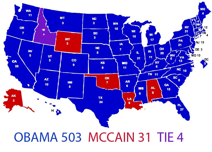
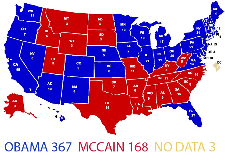
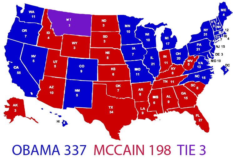
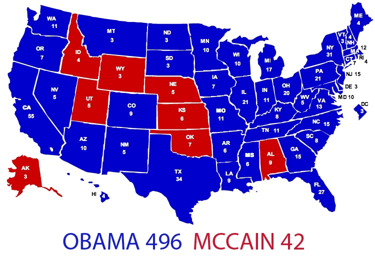
I spent the weekend poring over the CNN exit pollsfrom last Tuesday’s election and converting the state-by-state data for a number of demographics into my own hypothetical electoral maps.
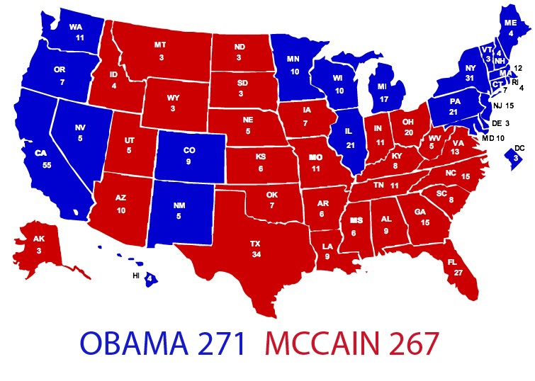
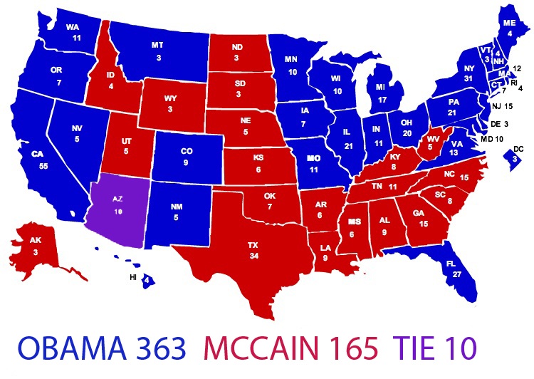
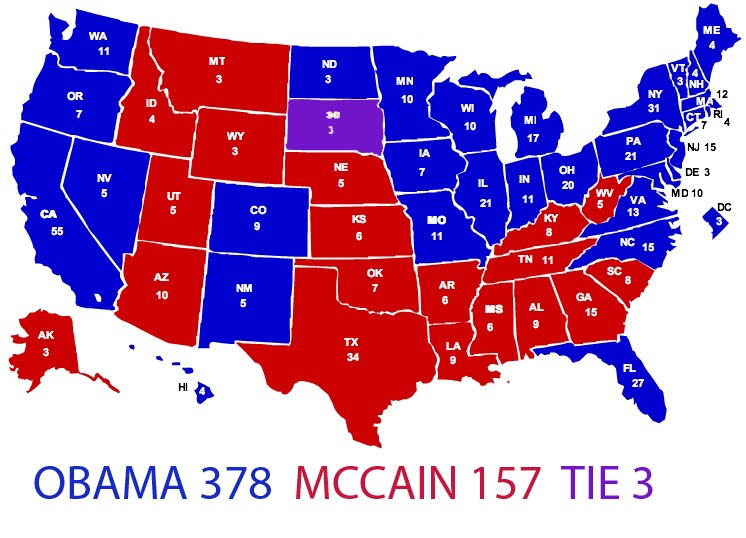
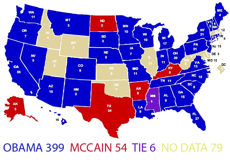
The result is a set of maps that visualize the outcome of an election decided exclusively by the following age groups, genders, income groups, political affiliations, etc.:
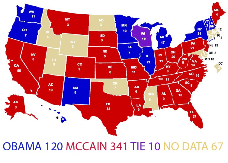
Voters age 65 and older:
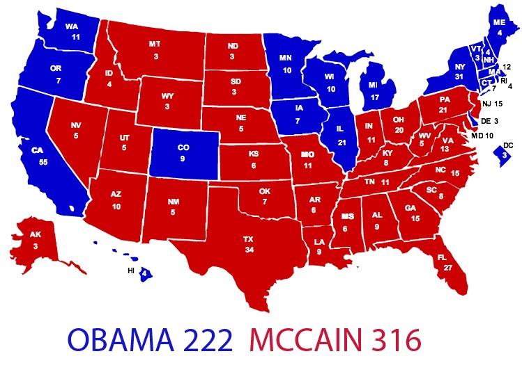
**White voters: **(A “black voters” map would be a sea of blue.)
Men:
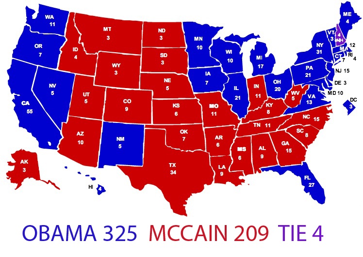
Women:
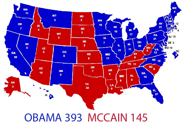
Self-described political moderates:
Registered independents:
College graduates:
Voters earning under $50,000 per year:
Voters earning over $50,000 per year:
Voters who are “worried about economic conditions”:
Voters whose “most important issue” was the economy:
Voters whose “most important issue” was the war in Iraq:
Now that the roller coaster that was 2008 has come to an end, we thought it would be fun to look back at some of our most popular, thought-provoking and entertaining posts from The Streak over the past year. This post was chosen by TWI staff as one of the most memorable of 2008.

Hajra Shannon
Reviewer
Latest Articles
Popular Articles
