This Is What the 2008 Electoral Map Would Look Like if the Election Were Decided by [Fill In the Blank]
A number of sites have featured a hypothetical electoral map entitled This Is What the 2008 Electoral Map Would Look Like if the Election Were Decided by 18-29
Jul 31, 20206.1K Shares119.9K Views
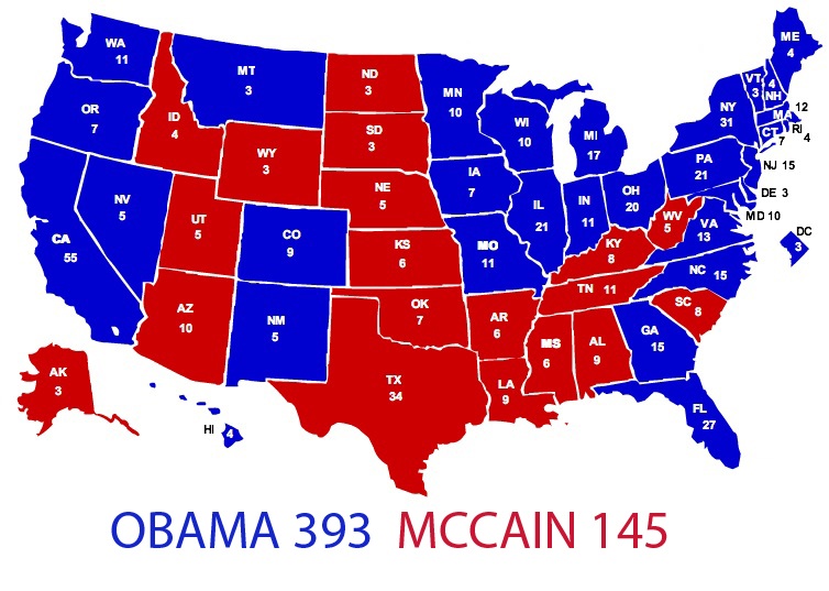
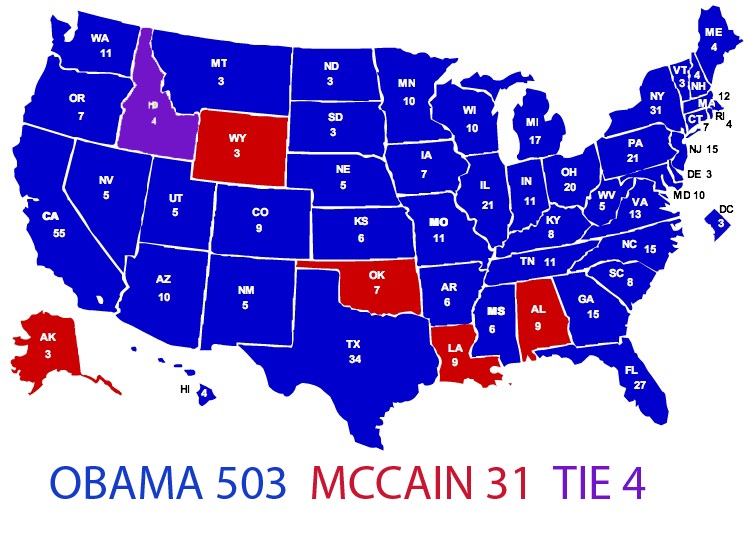
A number of sites have featured a hypothetical electoral mapentitled “This Is What the 2008 Electoral Map Would Look Like if the Election Were Decided by 18-29 Year Olds.” Needless to say, it’s a very blue map.
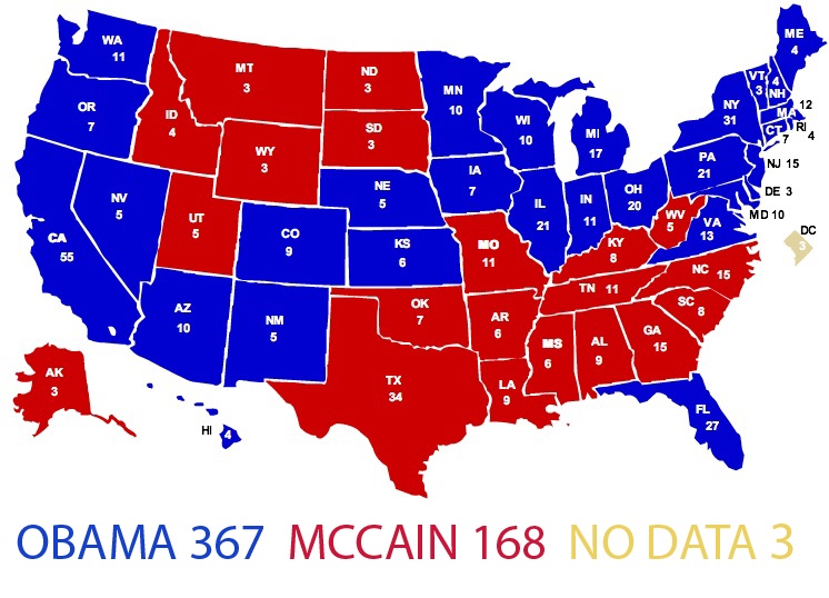
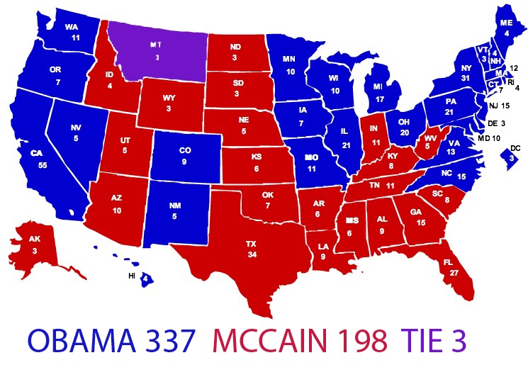
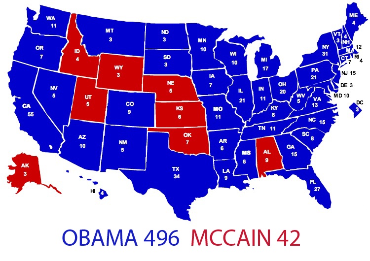
I spent the weekend poring over the CNN exit pollsfrom last Tuesday’s election and converting the state-by-state data for a number of demographics into my own hypothetical electoral maps.
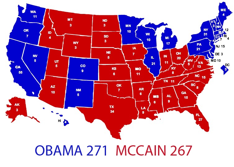
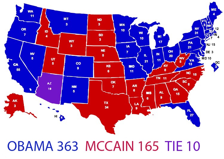
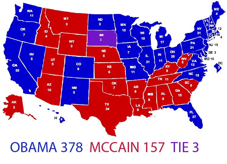
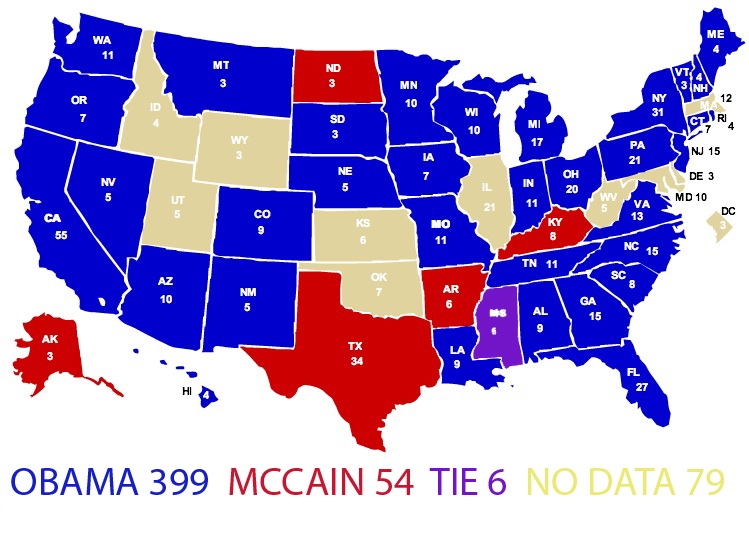
The result is a set of maps that visualize the outcome of an election decided exclusively by the following age groups, genders, income groups, political affiliations, etc.:
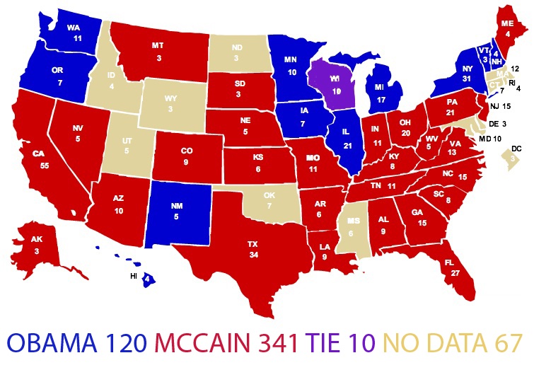
Voters age 65 and older:
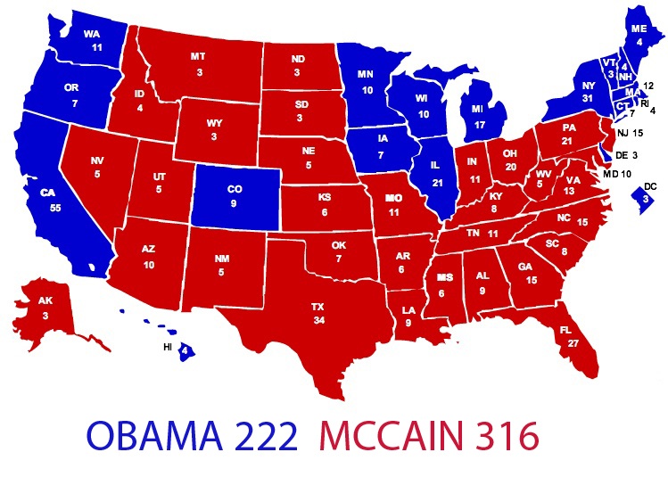
**White voters: **(A “black voters” map would be a sea of blue.)
Men:
Women:
Self-described political moderates:
Registered independents:
College graduates:
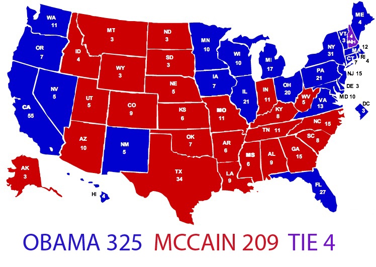
Voters earning under $50,000 per year:
Voters earning over $50,000 per year:
Voters who are “worried about economic conditions”:
Voters whose “most important issue” was the economy:
Voters whose “most important issue” was the war in Iraq:

Rhyley Carney
Reviewer
Latest Articles
Popular Articles
